In the last blog post you learned how to populate data into a Combo Box, a List Box and a Data Grid. In each of the previous samples, you just used the default display for those controls. In this blog post you learn to control how the data is displayed using templates. In addition, you learn to use a List View control to display tabular data.
Modify WPF Sample Project
Open the WPF project from Part 1 of this blog post series. Open the MainWindow.xaml file and add three new menu items used to display the new user controls you are adding to this sample.
<MenuItem Header="ComboBox"
          Click="MenuItem_Click"
   Tag="WPF.ListControls.ListControlsTemplate.ComboBoxTemplate" />
<MenuItem Header="DataGrid"
          Click="MenuItem_Click"
   Tag="WPF.ListControls.ListControlsTemplate.DataGridTemplate" />
<MenuItem Header="ListView"
          Click="MenuItem_Click"
   Tag="WPF.ListControls.ListControlsTemplate.ListViewTemplate" />
Add Folder for Templated Controls
Right mouse-click on the project and add a new folder named ListControlsTemplate. It is in this folder you are going to create all the user controls used to illustrate how to use templated list controls.
Modify the Product View Model Class
One of the templates you are going to create will be to display a color and the name of the color within the Combo Box control. You need to create a new method and a new property in the ProductViewModel class. Open the ProductViewModel.cs file and add a new using statement.
using System.Linq;
Next, add a new property used to hold a distinct list of colors found in the Product table.
public ObservableCollection<Product> ProductColors { get; set; }
Modify the LoadProducts() method and populate the ProductColors property using some LINQ code to select only the distinct colors in the Product table.
public virtual ObservableCollection<Product> LoadProducts()
{
  try {
    using (AdventureWorksLTDbContext db =
              new AdventureWorksLTDbContext()) {
      Products = new ObservableCollection<Product>(db.Products);

      // Load distinct colors
      ProductColors = new ObservableCollection<Product>(
        (from prod in Products select prod)
          .GroupBy(p => new { p.Color })
          .Select(g => g.FirstOrDefault())
          .ToList());
    }
  }
  catch (Exception ex) {
    System.Diagnostics.Debug.WriteLine(ex.ToString());
  }

  return Products;
}
Combo Box Template to Display Color
Let's now build this new Combo Box control to display a color and the name of the color within the Combo Box. Right mouse-click on the ListControlsTemplate folder and add a new user control name ComboBoxTemplate. Add a new XML namespace to the <UserControl> definition.
xmlns:vm="clr-namespace:WPF.ListControls.ViewModels"
Just below the <UserControl> definition, add a UserControl.Resources section in which you create a new instance of the ProductViewModel class.
<UserControl.Resources>
  <vm:ProductViewModel x:Key="viewModel" />
</UserControl.Resources>
Within the <Grid> control add a ComboBox control. Set the ItemsSource property to a binding that references the source as the viewModel you created in the UserControl.Resources section of this user control. The Path of the data is the ProductsColors collection you created in the ProductViewModel class.
Add a <ComboBox.ItemTemplate> element within the <ComboBox> element. Within this template, add a <DataTemplate>. It is within this <DataTemplate> that you can add any amount of XAML that you want. In this case, I am creating a <Border> with the BorderBrush property bound to the Color property on the Product class. This causes the color specified in the Product table to be drawn in a Border control. The rest of the Text Block controls are used to display the color name and the name of the product.
<ComboBox ItemsSource="{Binding Source={StaticResource viewModel},
                                Path=ProductColors}">
  <ComboBox.ItemTemplate>
    <DataTemplate>
      <StackPanel Orientation="Horizontal">
        <Border BorderBrush="{Binding Path=Color}"
                BorderThickness="8"
                Margin="0,0,8,0" />
        <TextBlock Text="{Binding Path=Color}" />
        <TextBlock Text=" - " />
        <TextBlock Text="{Binding Path=Name}" />
      </StackPanel>
    </DataTemplate>
  </ComboBox.ItemTemplate>
</ComboBox>
Try it Out
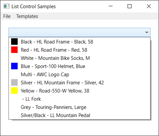
Run the application and click on the Templates | ComboBox menu item. You should see a screen that looks like Figure 1.
Data Grid - Column Definitions
In the last blog post, you added a Data Grid to a user control and all properties in the Product class were displayed in separate columns of the Data Grid. The AutoGenerateColumns property is set to a true value by default. This means the Data Grid will read all properties bound to it and render a column for each one. However, you can explicitly set the AutoGenerateColumns property to a false value and supply your own columns if you wish to change the order, or eliminate some columns from the list displayed.
Right mouse-click on the ListControlsTemplate folder and add a new user control name DataGridTemplate. Add a new XML namespace to the <UserControl> definition.
xmlns:vm="clr-namespace:WPF.ListControls.ViewModels"
Just below the <UserControl> definition, add a UserControl.Resources section in which you create a new instance of the ProductViewModel class.
<UserControl.Resources>
  <vm:ProductViewModel x:Key="viewModel" />
</UserControl.Resources>
Within the <Grid> control add a Data Grid control and set the AutoGenerateColumns property to a false value. Set the ItemsSource property to a binding that references the source as the viewModel you created in the UserControl.Resources section of this user control. The Path of the data is the Products collection you created in the ProductViewModel class.
Within the <DataGrid> element add a <DataGrid.Columns> element. Within this new element, add <DataGridTextColumn> elements and bind them to a few of the properties in the Product class.
<DataGrid ItemsSource="{Binding Source={StaticResource viewModel},
                                Path=Products}"
          AutoGenerateColumns="False">
  <DataGrid.Columns>
    <DataGridTextColumn Header="Name"
                        Binding="{Binding Path=Name}" />
    <DataGridTextColumn Header="Color"
                        Binding="{Binding Path=Color}" />
    <DataGridTextColumn Header="Cost"
                        Binding="{Binding Path=StandardCost}" />
    <DataGridTextColumn Header="Price"
                        Binding="{Binding Path=ListPrice}" />
    <DataGridTextColumn Header="Size"
                        Binding="{Binding Path=Size}" />
    <DataGridTextColumn Header="Weight"
                        Binding="{Binding Path=Weight}" />
  </DataGrid.Columns>
</DataGrid>
Try it Out
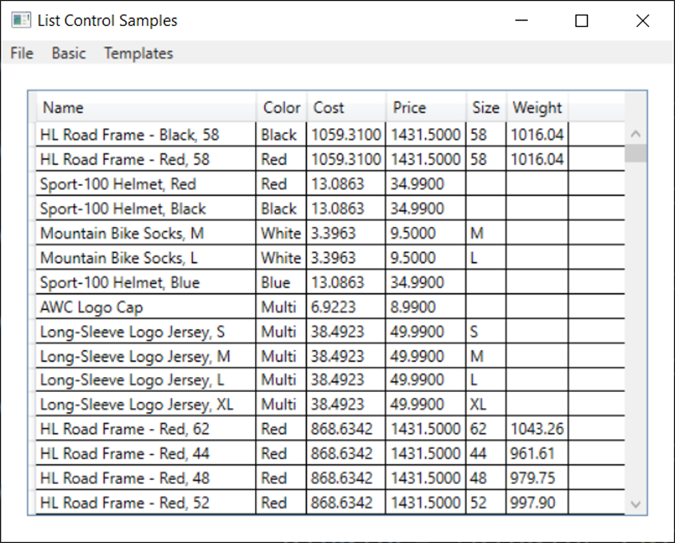
Run the application and click on the Templates | DataGrid menu item. You should see a screen that looks like Figure 2.
Format Cost and Price Columns
The <DataGridTextColumn> objects are what is created when the AutoGenerateColumns property is set to true. You can add a StringFormat attribute to the Binding property on the <DataGridTextColumn> to have these values formatted a currency values when displayed. Add the following attributes to the Cost and Price columns and re-run the application to see the values formatted.
<DataGridTextColumn Header="Cost"
  Binding="{Binding Path=StandardCost, StringFormat=c}" />
<DataGridTextColumn Header="Price"
  Binding="{Binding Path=ListPrice, StringFormat=c}" />
The Cost and Price now appear as currency values, but the values are left-justified. They should be right-justified, as most currency values are displayed to the right when presented in a spreadsheet. To accomplish this, replace the <DataGridTextColumn> elements for Cost and Price with <DataGridTemplateColumn> elements.
<DataGridTemplateColumn">
  <DataGridTemplateColumn.HeaderTemplate>
    <DataTemplate>
      <TextBlock TextAlignment="Right" Text="Cost" />
    </DataTemplate>
  </DataGridTemplateColumn.HeaderTemplate>
  <DataGridTemplateColumn.CellTemplate>
    <ItemContainerTemplate>
      <TextBlock TextAlignment="Right"
         Text="{Binding Path=StandardCost, StringFormat=c}" />
    </ItemContainerTemplate>
  </DataGridTemplateColumn.CellTemplate>
</DataGridTemplateColumn>

<DataGridTemplateColumn>
  <DataGridTemplateColumn.HeaderTemplate>
    <DataTemplate>
      <TextBlock TextAlignment="Right" Text="Price" />
    </DataTemplate>
  </DataGridTemplateColumn.HeaderTemplate>
  <DataGridTemplateColumn.CellTemplate>
    <ItemContainerTemplate>
      <TextBlock TextAlignment="Right"
                 Text="{Binding Path=ListPrice, StringFormat=c}" />
    </ItemContainerTemplate>
  </DataGridTemplateColumn.CellTemplate>
</DataGridTemplateColumn>
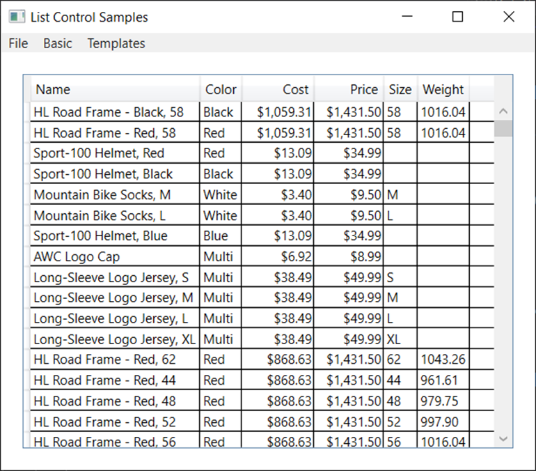
After replacing the Cost and Price columns with the above code, run the application again and click on the Templates | DataGrid menu item. You should see the Cost and Price columns are now right-justified. However, notice that the column headers are still left-justified, even though you specified TextAlignment="Right" for the header Text Block control.
Formatting the Cell Header
The problem is the <DataGridColumnHeader> element defined by WPF has it's HorizontalContentAlignment property set to the value "Left". Add a <DataGrid.Resources> element within your <DataGrid>. Add a <Style> element with a TargetType property set to "DataGridColumnHeader". Set the HorizontalContentAlignment property to a value of "Stretch". Once this property is set, you may now override the text alignment of the cell header.
<DataGrid AutoGenerateColumns="False"
          ItemsSource="{Binding Source={StaticResource viewModel},
                                Path=Products}">
  <DataGrid.Resources>
    <Style TargetType="DataGridColumnHeader">
      <Setter Property="HorizontalContentAlignment"
              Value="Stretch" />
    </Style>
  </DataGrid.Resources>
  <DataGrid.Columns>
    // Data Grid Columns Go Here
  </DataGrid.Columns>
</DataGrid>
Re-run the application and click on the Templates | DataGrid menu item to see your screen looking like Figure 3.
List View
Let's now look at another "list" control available to WPF applications; the List View. The List View control does not have a way to automatically generate a list of columns, so you must supply the columns you want to display to this control. This is done similar to how you just built columns for the Data Grid control. Right mouse-click on the ListControlsTemplate folder and add a new user control name ListViewTemplate. Add a new XML namespace to the <UserControl> definition.
xmlns:vm="clr-namespace:WPF.ListControls.ViewModels"
Just below the <UserControl> definition, add a <UserControl.Resources> section in which you create a new instance of the ProductViewModel class.
<UserControl.Resources>
  <vm:ProductViewModel x:Key="viewModel" />
</UserControl.Resources>
Within the <Grid> control, add a <ListView> element. Set the ItemsSource property to a binding that references the source as the viewModel you created in the UserControl.Resources section of this user control. The Path of the data is the Products collection you created in the ProductViewModel class.
<ListView ItemsSource="{Binding Source={StaticResource viewModel},
              Path=Products}">
</ListView>
Add a <ListView.View> element within the List View control. It is in this element you create the collection of columns you wish to display within the List View control. For simple, left-aligned data, use a <GridViewColumn> element bound to the property name you wish to display.
<ListView.View>
  <GridView>
    <GridViewColumn Header="Name"
                    DisplayMemberBinding="{Binding Path=Name}" />
    <GridViewColumn Header="Color"
                    DisplayMemberBinding="{Binding Path=Color}" />
    <GridViewColumn>
      <GridViewColumn.Header>
        <TextBlock TextAlignment="Right"
                    Text="Cost" />
      </GridViewColumn.Header>
      <GridViewColumn.CellTemplate>
        <DataTemplate>
          <TextBlock TextAlignment="Right"
            Text="{Binding Path=StandardCost, StringFormat=c}" />
        </DataTemplate>
      </GridViewColumn.CellTemplate>
    </GridViewColumn>
    <GridViewColumn>
      <GridViewColumn.Header>
        <TextBlock TextAlignment="Right"
                    Text="Price" />
      </GridViewColumn.Header>
      <GridViewColumn.CellTemplate>
        <DataTemplate>
          <TextBlock TextAlignment="Right"
            Text="{Binding Path=ListPrice, StringFormat=c}" />
        </DataTemplate>
      </GridViewColumn.CellTemplate>
    </GridViewColumn>
    <GridViewColumn Header="Size"
                    DisplayMemberBinding="{Binding Path=Size}" />
    <GridViewColumn Header="Weight"
                    DisplayMemberBinding="{Binding Path=Weight}" />
  </GridView>
</ListView.View>
Right-Align Headers
The <GridViewColumnHeader> element defined by WPF has it's HorizontalContentAlignment property set to the value "Left". Override this value for the List View control by adding a <ListView.Resources> element within your <ListView>. Add a <Style> element with a TargetType property set to "GridViewColumnHeader". Set the HorizontalContentAlignment property to a value of "Stretch". Once this property is set, the text alignment of the column headers can be overridden.
<!-- Use the following so column headers can be aligned -->
<ListView.Resources>
  <Style TargetType="GridViewColumnHeader">
    <Setter Property="HorizontalContentAlignment"
            Value="Stretch" />
  </Style>
</ListView.Resources>
Right Align Columns
The <ListViewItem> element defined by WPF has it's HorizontalContentAlignment property set to the value "Left". Override this value for the List View control by adding a <ListView.ItemContainerStyle> element within your <ListView>. Add a <Style> element with a TargetType property set to "ListViewItem". Set the HorizontalContentAlignment property to a value of "Stretch". Once this property is set, the text alignment of the column data can be overridden.
<!-- Use the following so column content can be aligned -->
<ListView.ItemContainerStyle>
  <Style TargetType="ListViewItem">
    <Setter Property="HorizontalContentAlignment"
            Value="Stretch" />
  </Style>
</ListView.ItemContainerStyle>
Try it Out
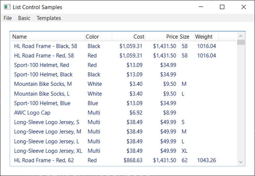
Run the application and click on the ListView menu item under the Templates menu and you should see a screen appear that looks like Figure 4.
Summary
In this blog post you learned how to create custom templates for combo boxes, data grids and list views. The Data Grid control is great if you just want to display some data quickly as it automatically generates columns for each property in your class. A List View control is used when you want to explicitly define each column to display. In order to change the alignment of columns it is sometimes necessary to override certain built-in WPF styles.
#wpf #pauldsheriff #development #programming